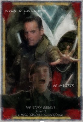
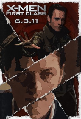
“X-Men: First Class” Posters
I had wanted to take a stab at some new posters and coincidentally enough, one of my fave site, Super Punch announced a contest for users to create anything better in a “X-Men: First Class” movie poster than what had already been made by the studios. Sadly, this wouldn’t be hard for say, even a newbie Photoshop user, since at this time the only graphics that have been released so far are….just not great. I like the studio made one with just the metal “X” logo but I’ve always been biased towards any kind of rendered metal so there ya go.
Click images for larger versions.
I didn’t win the Super Punch contest but no matter, the look of the posters was supposed to be 60′s inspired (that’s when the new film will be set in) but of course, I went off on my usual, personal tangent and missed the themes target. I’m happy with the final results though, especially the “Group” poster and very especially the “Torn” poster.
The contest winner was Clyde Bailey and I gotta agree, he hit the poster theme square, dead-bang, imo but yeah, I really liked all the entries. See the poster page here over at Super Punch to have a look at all the entries along with a users animated video version of a James Bond/Saul Bass inspired opening credit sequence for the movie. Be sure to check the rest of Super Punch out, it’s truly unique and cool (toys, comics, video games and artwork but really just anything cool)


Stands back from the keyboard in amazement! Thanks!
July 18, 2011 at 9:55 pm
A lot of thought went into this, but Im not sure Mr Munkittrick knows much concerning the construction of fiction and CG movies.
September 16, 2011 at 2:47 am
Hello there! This is my first visit to your blog! We are a collection of volunteers and starting a new project in a community in the same niche. Your blog provided us valuable information to work on. You have done a marvellous job!
September 16, 2011 at 12:01 pm