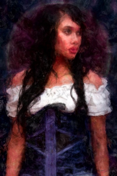
Barmaid Painting
*Print available over at deviantART.
With this painting I used stock photography by Cathleen Tarawhiti as my starting point and color reference.
The finished file consists of three layers of paint (rough underpainting, medium detail and a touch-up layer), and two
layers of pencil (one shading, one sketch) also a couple effects layers and a ridiculous amount of adjustment layers.
The final painting was done in Photoshop CS6 at 3,600 x 5,400 in 16-bit with the ProPhoto RGB gamut, so in comparison
with these jpg’s, the real color count is actually far higher and more intense. (and a pain to convert back for the web)
Big thanks to Cathleen for her beautiful stock collection and to the wonderful model, Mahia Keepa-Hale!
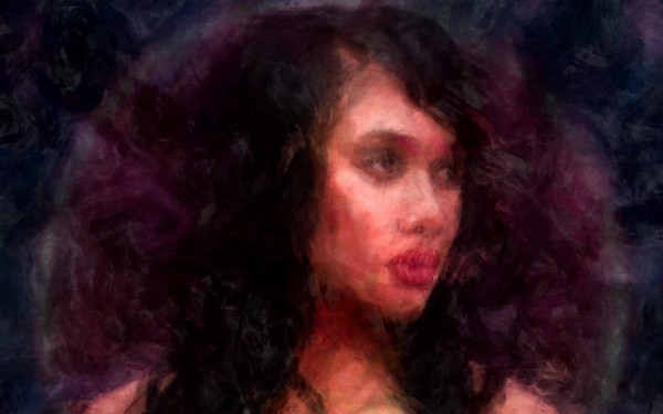
Here is a desktop wallpaper version (2560×1600). You can catch more detail in this crop, click through to get the full sized image;
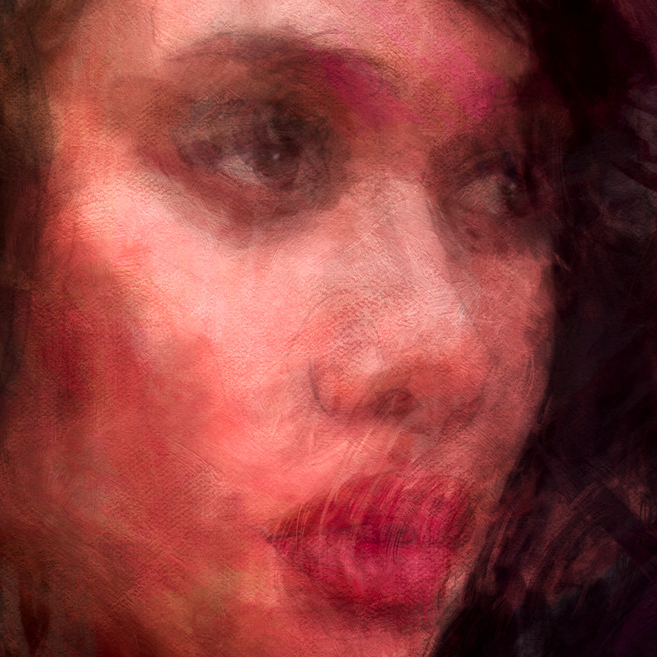
Here is a 1:1 crop from the full sized original;
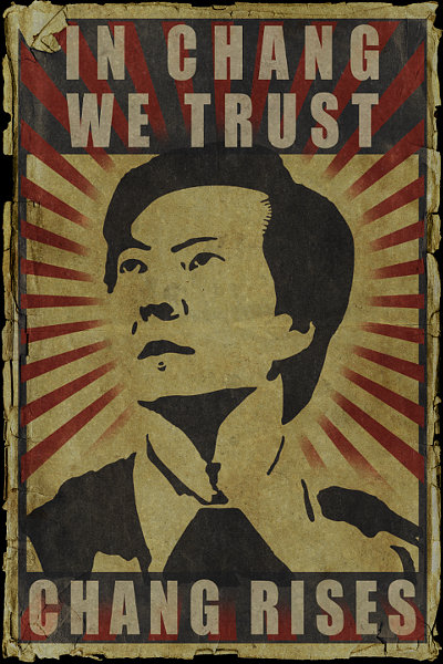
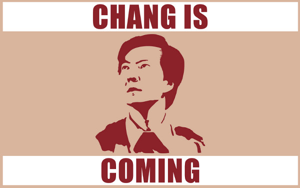
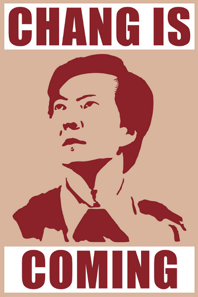
“Community” – Chang Rising Poster #2
“Community” RETURNS – March 15th – 8:00pm – NBC
Community Returns TODAY, so be ready with my next Chang Rising Poster!
This one may be half size but still looks Chang-tastic printed out full sized at 24 x 36!
Glorious “Manilla” poster: (4.5Mb, jpg) (3,600×5,400)– Download Here!
Again;
All rights reserved to: NBC, Sony Pictures Television, Universal Media Studios, Russo Brothers,
Harmonius Claptrap, Krasnoff Foster Productions, the eternaly Chan-tastic Ken Jeong and
anyone else at NBC that will promise to never even THINK about cancelling “Community”!
Now pardon me while I stare at my blackened HDTV for the next 12 hours until COMMUNITY COMES ON.
Kirk
kirk@kirkdunne.com
#changrises !!!!!!!!!!!!!!!!!!!!!!!!!!!!!!!!!!!!!!!!!!!!!!!!!!!!!
“Community” – Arise, Chang Army!
In Chang We Trust
*NOTICE – If I did happen to guess WRONG at what is at the bottom of this poster, I WILL be adding a corrected version.
Chang Poster available in;
Wallpaper sized: (104kb) (2560×1600) – Download Here! - Also, a 16:9 ratio wallpaper: (62kb) (1920×1080) – Download Here!
Gloriously full-sized poster: (714kb) (7,200×10,800, which is 24″x36″) – Download Here!
This one is so Chan-tasticly huge it probably won’t load into most browser windows.
I suggest right-clicking the link and choosing “Save Link As”
Info;
Based upon the Chan-tastic Chan poster being unfurled in the “Community Returns!” trailer.
Watch the video here, Chang poster at the 0:30 second mark)
Obviously, I’m just guessing at what’s actually at the bottom of that poster.
Come March 15th, the full Chang shall be revealed!
All images are in png format, created in Photoshop CS5.
All rights reserved to: NBC, Sony Pictures Television, Universal Media Studios, Russo Brothers,
Harmonius Claptrap, Krasnoff Foster Productions, the eternaly Chan-tastic Ken Jeong and
anyone else that would like to dogpile in on some of this copyright action.
“To know your Chang, you must become your Chang.”
– The Art of Chang
Kirk
kirk@kirkdunne.com
*This page is in fandom spirit of the AMAZING NBC comedy Television show “Community“.
If you’ve never seen it, do so NOW and level up your coolness by a roll of at least +10.
*So, realize this is all in fun and therefore I am not a communist.
(Sorry commies)
*I am also not a rabid celebrity stalker of Ken Jeong.
(Sorry Ken, you are awesome…but at this moment in my life, you’re just not “go to jail” awesome…as I am still paying off my plasma flatscreen)
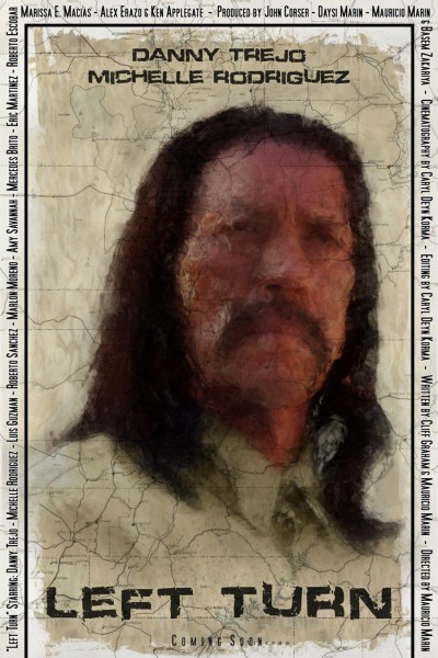
“Left Turn” – The Road Poster
Based upon Director Mauricio Marin’s idea of having the lines of the road fading outward from the expressionistic
facial lines of Danny Trejo (Samuel Lopez) this is the first in a series of posters for the film “Left Turn”.
I finished this piece quickly, so what you see here will most likely be the first version with a more refined second
version to come as I feel this could be fleshed out much more faithfully to Mauricio’s original idea.
But, for now v2 will wait as more and different art is to come for “Left Turn”.
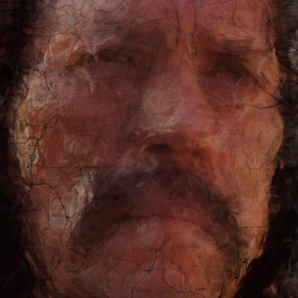
Here’s a 1:1 detail, click through to see its full size;
Technical Info;
Painted in Photoshop CS5 in around 50 hours.
Because of how quickly I needed to completed this, it is only half sized at 12″ x 18″, 300dpi.
(v2 will be the standard 24″ x 36″)
For the initial sketching and layout, I used VFX Workshops Pencil Brush Pack, available here.
For painting, I used mainly the default CS5 Mixer brushes. I have some custom
Mixer brushes but they aren’t very far away from the default setup’s at all.
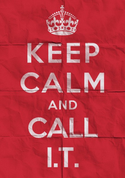
Keep Calm – I.T. Poster
Click through on the main poster below to grab the high-res version (2480×3508) (4mb jpg)
Made for fun and for an associate that works in I.T.
(Information Technology)
Created in Photoshop CS5, roughly 30 minutes.
Detail of full size.
The history on the original, UK “Keep Calm And Carry On” posters can be read about here.
“X-Men: First Class” Posters
I had wanted to take a stab at some new posters and coincidentally enough, one of my fave site, Super Punch announced a contest for users to create anything better in a “X-Men: First Class” movie poster than what had already been made by the studios. Sadly, this wouldn’t be hard for say, even a newbie Photoshop user, since at this time the only graphics that have been released so far are….just not great. I like the studio made one with just the metal “X” logo but I’ve always been biased towards any kind of rendered metal so there ya go.
Click images for larger versions.
I didn’t win the Super Punch contest but no matter, the look of the posters was supposed to be 60′s inspired (that’s when the new film will be set in) but of course, I went off on my usual, personal tangent and missed the themes target. I’m happy with the final results though, especially the “Group” poster and very especially the “Torn” poster.
The contest winner was Clyde Bailey and I gotta agree, he hit the poster theme square, dead-bang, imo but yeah, I really liked all the entries. See the poster page here over at Super Punch to have a look at all the entries along with a users animated video version of a James Bond/Saul Bass inspired opening credit sequence for the movie. Be sure to check the rest of Super Punch out, it’s truly unique and cool (toys, comics, video games and artwork but really just anything cool)
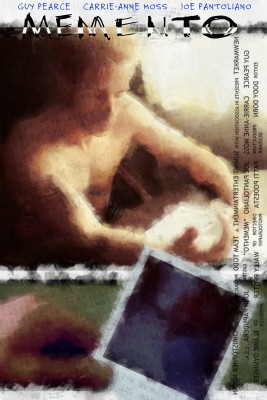
“Memento” Poster
Memento is one of my all time favorite movies and since it had came up on its 10 year anniversary, I decided to make my own version of its poster.
Work was all painted in Photoshop CS5, original size is 3000×4500.
The Title/Block credits were reversed as to mimic some of Guy Pearce’s tattoo’s from the movie which were backwards, so he could read them in a mirror.
The text that is lightly laid out over the entire poster is a listing of all the text, in tattoo form that Guy Pearce’s character carried on him to remind himself of important facts.
