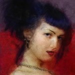
“There are nights when the wolves are silent and only the moon howls.”
- George Carlin
Happy Halloween everybody!!
Painted in Photoshop CS5. Keep clicking on image to see full size.
“The rabbit-hole went straight on like a tunnel for some way, and then dipped suddenly down, so suddenly that Alice had not a moment to think about stopping herself before she found herself falling down a very deep well. Either the well was very deep, or she fell very slowly, for she had plenty of time as she went down to look about her and to wonder what was going to happen next.”
I had downloaded and got inspired by the “Alice In Wonderland” free epub book for pc Kindle, available from the Project Gutenberg site HERE.
(they provide many formats and also carry a lot of other public domain books).
Painted in Photoshop CS5, on five layers in around 20 hours total.
Click the image to grab the full sized version.
After clicking the thumbs above, you will see a larger version AND an additional text link to download the full / original sized pieces. (they’re BIG)
A Photoshop CS5 sketch and painting. As far as the final painting goes; I wanted to experiment with a stylized look to the Octopus
and I eventually chose to use two divided styles together; a tight cell-shaded line work laid atop a loose wet-on-wet painting below.
To play a bit further on divisions, I used a hard, flat wood surface to contrast the pliable, gelatinous characteristics of the Octopus.
The sketch was created at 2K, the painting made at 3K, with probably around 30 hours total put into making both.
(about an hour or so for the sketch and with a good amount of the rest just being spent on various experimentation’s with the painting.)
Gotta admit, although I don’t eat Calamari often, this does kinda makes me wanna pull out a chopping board and skillet.
Around six weeks ago, I received a commissioned request to create a portrait painting from “Phacet”, a very cool and unique lady who is over at Suicide Girls.
SG is a (nsfw) website that shows pin-up, rocker and just basically alternative looking girls in various stages of undress. She had wanted me to build from her
existing photo’s, so after choosing a few as reference, I created a pin-up themed painting for her. I’m very happy with the results even though I believe my work doesn’t
hit a perfect bullseye for her, it’s on the dartboard. When I have time, I have promised Phacet a second piece.
Detail from original#1:  Detail from original#2:
*On the subject of art showing humans and specifically here women, I will almost always opt for something that shows “sexy over sexual”. When it comes to something
artistic I myself appreciate more the attitude of an expression, style or of a pose over just showing nudity. Basically in my opinion, nudity is easy. Great lines, composition,
and attitude; those attributes I believe are harder to achieve yet makes for a better piece of art in any media. So, that’s what I am striving for, whether nudity happens to
exist in the final result or not, to me, is beside the point.
Painting created in Photoshop CS5 at 6K.
©2011 All rights reserved to each individual model and to suicidegirls.com
This is Suicide Girl “Talena”, she is a wonderful model and had beautiful reference photos in which to work from and I do really like how this painting turned out.
And, with that being said…I will most likely re-visit this painting again one day as I’m not 100% happy with my work on it. I’m not sure the style I used works as
well as it could with this setting and I know the paintwork didn’t come out the absolute best. Looking forward to tackling this one again, and bringing up my work
a notch or two, as she does have a subtle and cool expression and the setting has great, bold colors.
Painting created in Photoshop CS5 at 2.5K.
©2011 All rights reserved to each individual model and to suicidegirls.com
Detail from original 4K painting: 
Mary is one of the very early Suicide Girls and in my personal opinion, has a very “classic” look in the vein of pin-up girls and of the SG website.
Mary had a huge amount of reference to go through and I chose a seperate pose, expression and hair to use as reference for the final painting here.
I believe the style and paintwork mesh pretty well with Mary’s pose and composition as overall I see the final result here being very sexy but not over the top.
Painting created in Photoshop CS5 at 4K.
©2011 All rights reserved to each individual model and to suicidegirls.com
I had wanted to take a stab at some new posters and coincidentally enough, one of my fave site, Super Punch announced a contest for users to create anything better in a “X-Men: First Class” movie poster than what had already been made by the studios. Sadly, this wouldn’t be hard for say, even a newbie Photoshop user, since at this time the only graphics that have been released so far are….just not great. I like the studio made one with just the metal “X” logo but I’ve always been biased towards any kind of rendered metal so there ya go.
Click images for larger versions.
I didn’t win the Super Punch contest but no matter, the look of the posters was supposed to be 60′s inspired (that’s when the new film will be set in) but of course, I went off on my usual, personal tangent and missed the themes target. I’m happy with the final results though, especially the “Group” poster and very especially the “Torn” poster.
The contest winner was Clyde Bailey and I gotta agree, he hit the poster theme square, dead-bang, imo but yeah, I really liked all the entries. See the poster page here over at Super Punch to have a look at all the entries along with a users animated video version of a James Bond/Saul Bass inspired opening credit sequence for the movie. Be sure to check the rest of Super Punch out, it’s truly unique and cool (toys, comics, video games and artwork but really just anything cool)