Artwork and resources, past and present.

Latest

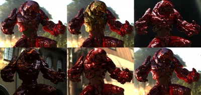
“Beo Bot” – HDRI Testing

Using the BEO2K10 Robot to test out some new HDRI’s for lighting.
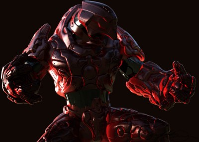
 

Here’s some other non-finished renders. As I said, I was really testing just some various HDRI’s and at the time didn’t need finished images.
 

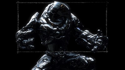
But, I did return to this scenefile later and tried a different (chrome) texture on the bot along with using Photoshop to post-work some dust all over him. The painted rectangle is the 16:9 ratio that I use almost exclusively now with all my renders. This is the render you see as the splash page on my website.
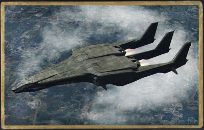
“Eyes Only”

A quick 3D render I did using a friends (Richard Jeffries) mesh, “Trim-Lite“.


Ship textures by me in Photoshop CS5.
Ground texture is a 4K satellite image of Disneyworld, available here.
Post-work in Photoshop CS5. (Jet exhaust, photo-aging, chromatic aberration, etc)

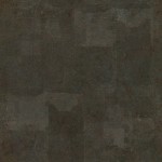
The ship texture I made (It was tiled across the mesh), feel free to re-use as you wish.

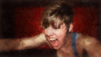
“Bloodlust”

I wanted to paint what I had been avoiding, which was something human and with emotion. Adding the subtle fangs to the girl was a bit of an afterthought done near the end.

I am really happy with how I’m getting along with Photoshop CS5′s Mixer Brushes. I feel I am fine tuning them more with each new painting and getting them and myself closer to where I want to be with the look and feel of the final result. The overall style I like and am aiming for is one of looseness, one in which you see hopefully see expressiveness in clearly seeing the brush strokes.

This is all serving me well in stepping back from the perfect exactness of 3D, which I love to do and always will but this more raw looking 2D painting, feels great to be able to make.

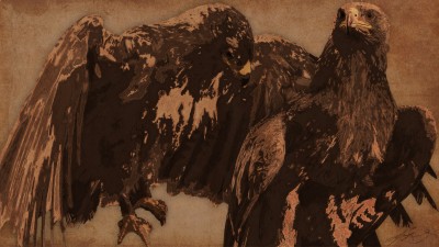
“Bird’s Eye”

Photoshop CS5 with Mixer Brushes. Original painting made at 4K.

I wanted to force myself to try and represent something in a painting with a limited amount of solid shades (each on a seperate layer, actually). I got it down to about 15 shade layers; a couple layers for the yellows of the beaks and claws, a couple of layers of white for the highlights and the rest are shades of black. All the layers are set to various levels of opacity to; either screen (for the yellows and white) or multiply for the blacks. What this did was “tint” the original background, which is a scan of a grocery store paper bag.

This is either a Brown Hawk or Eagle, I’m not truly sure what it should be considered as I found out later the only major difference between the two bird types are that eagles are larger than hawks. Imo, I say hawk.

“Sony Move” Photo Manipulation

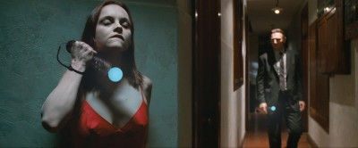
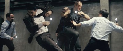
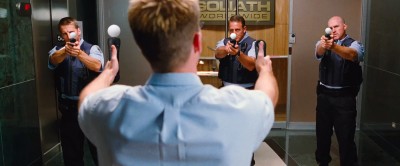
Gizmodo had a contest to see how people could insert the Sony Move into snapshots from movies, trying to integrate the Move into the scene itself. I had ten ideas and screenshots but only had time to complete three entries. One of my entries placed third.

This is Christina Ricci and Liam Neeson from the movie “After.Life“. This is the entry that had placed. I think you can see why…


Fight Scene from “Repo Men” with Jude Law. This was actually my favorite entry that I did.


Chris Evans (Capt America) from “The Losers“. The guard on the right is Stunt Man Garret Warren, he also worked on A Christmas Carol and Mars Needs Moms (as I did).


Original Contest Link – Contest Announcement.

Final Entries – Gizmodo has changed the format of their website and the entries are not showing up, so the link is to a Google cached view of all the entries, which right now, does work.

My Freebies #7 – Image Textures – Misc.

Here is group #7 of seamless / tile-able image textures for your own use, from myself.

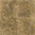
#1, stone tile floor, 2K
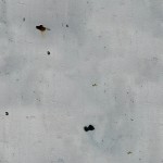
#2, aged painted metal, 2K
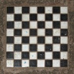
#3, concrete chess board, 1K
#4 billiard table felt, 1K
#5, human skin sample, 1K

Feel free to use these for your personal or commercial projects, whatever you want.
Enjoy!

“Memento” Poster

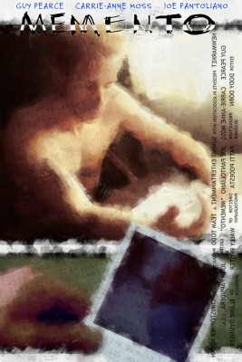
Memento is one of my all time favorite movies and since it had came up on its 10 year anniversary, I decided to make my own version of its poster.

Work was all painted in Photoshop CS5, original size is 3000×4500.

The Title/Block credits were reversed as to mimic some of Guy Pearce’s tattoo’s from the movie which were backwards, so he could read them in a mirror.

The text that is lightly laid out over the entire poster is a listing of all the text, in tattoo form that Guy Pearce’s character carried on him to remind himself of important facts.