“Beo Bot” – HDRI Testing
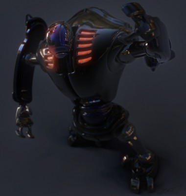
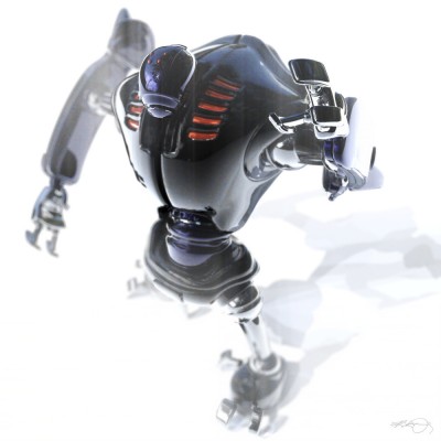
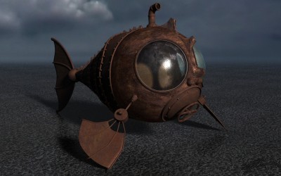
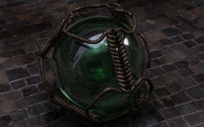
Using the BEO2K10 Robot to test out some new HDRI’s for lighting.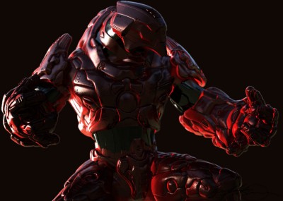
Here’s some other non-finished renders. As I said, I was really testing just some various HDRI’s and at the time didn’t need finished images.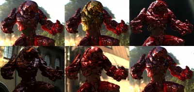
But, I did return to this scenefile later and tried a different (chrome) texture on the bot along with using Photoshop to post-work some dust all over him. The painted rectangle is the 16:9 ratio that I use almost exclusively now with all my renders. This is the render you see as the splash page on my website.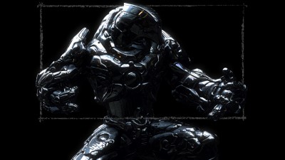
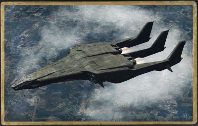
“Eyes Only”
A quick 3D render I did using a friends (Richard Jeffries) mesh, “Trim-Lite“.
Ship textures by me in Photoshop CS5.
Ground texture is a 4K satellite image of Disneyworld, available here.
Post-work in Photoshop CS5. (Jet exhaust, photo-aging, chromatic aberration, etc)
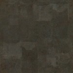
The ship texture I made (It was tiled across the mesh), feel free to re-use as you wish.
“Link” Robot
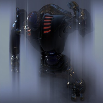
I was playing around with some various new HDRI settings using the Link robot. Here are a few of the renders I made.
I also experimented in Photoshop with trying some new techniques when creating the DOF blurring in post-work. Doing DOF in post is much, much faster than rendering with it and obviously allows for far greater flexibility in changing not only the level/amount of blurring but even what area is in focus. One problem with doing DOF in post is that; an object in great focus laid on top of an object in great blur will cause an outline halo around the object in focus (i.e.; a shallow dept of field). There are workarounds for this and they will usually work but in some cases they just fail and so I tried this; I cut out various parts of the robot out in Photoshop, then put them in separate layers and then blurred each layer individually. Since they were apart from one another, the amount of blur one layer received could not affect the other and no halo aberrations were created.
“Cranium Collection”
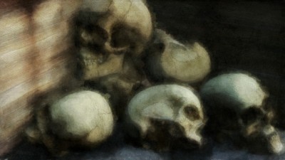
This was a big change for me. This is my first shot at painting using the new Photoshop CS5 and its dynamic painting brushes, called the Mixer Brushes. They are a HUGE difference over the old brushes as they can actually mix colors together as you would in the real world and they can simulate the look of traditional media pretty well.
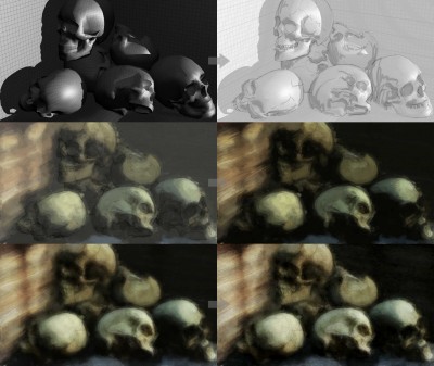
Another thing I have tried for the first time here was that this is a 3D “paint over”. I had set up some low-poly skulls in a scene, arranging them how I wanted along with frame composition, then after rendering that simple scene out, I brought it into Photoshop CS5 and painted over it, using the 3D render as way to have it all blocked out in advance. It’s a faster way to experiment with composition before committing to painting in addition to having zero problems with perspective. You can see a short workflow example below.
“Downpour” (Zombie Skeleton)
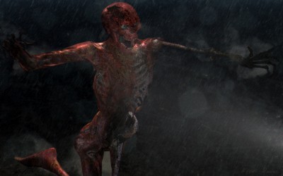
This zombie skeleton was basically a Halloween proof of concept for a personal project I was thinking about. What I originally wanted was a much larger scene with a handful of military soldiers battle-ing a wave of zombies. Alas, my eyes were too big for the time allotted and I didn’t have time to flesh out my whole, epic scene that I had in mind so, I just took this guy and finished him off as to show the look, feel and quality I was going for. One day, perhaps the whole battle can take place.
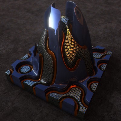
“Terrain Cone”
This was a another departure, one that I like to take quite often and that is to go about creating something in a way that is not the norm. In this case, I did not model this abstract piece with polygons but rather it is a image turned into a 3D mesh. There are many names for this depending on what program you are using. Nowadays, most 3D programs would call this a Displacement map.
LONG ago they were called G2H (grayscale to height) and if you are using a landscape generation program (Bryce, Terragen, Vue) you might import one called a DEM (Digital Elevation Map) and the resulting mesh in said programs would probably just be referred to as a “Terrain”.
The difference between a what a Displacement Map does and a “Terrain” is that a Displacement Map will displace (morph) an existing 3D mesh’s surface in any direction, while G2H/DEM is creating a 3D mesh based upon the image and with an image you only get creation on the Y axis, meaning up and down (height, elevation, etc) So, it’s limiting but still can be fun as in, anything I draw in Photoshop can be turned into a 3D mesh. Sure with limitations, but it leads to some bizarre/fun experimentation’s.
To be simple, a G2H/DEM Map is a grayscale (black and white) image. Any image can be used but ones with a greater amount of levels of gray are desired because this will give a better, smoother, more complex resulting mesh. I’m not going to get into it here (as it is a loooong explanation) but the best images for doing this are what are referred to as 16-bit grayscale and they can come in a handful of image format extensions, but one of the most common is .tif. The 16-bit part means they can have up to 65,535 levels of gray versus a .jpg which can only carry a maximum of 255 levels.
When turning an image into a mesh, its simple; lighter parts of an image result in higher areas of the resulting mesh, darker parts of the image produce lower areas.
So, back to the render and in very short order; I used a 2D program called Filter Forge and I tweaked a preset called “Truchet Tiling“. I rendered out the preset with Filter Forge set to render just the Bump Map at 2K. This gave me a grayscale looking image (it’s actually color). I took the image into Photoshop and manipulated it so I would have the various sections separated out so each section then could be turned into seperate 3D meshes, so I could apply different materials (textures, shaders, etc) to each one. Also in Photoshop, I had added a bright circle gradient on top of each seperate section as to produce the rising cone area in the 3D mesh.
I turned the images into meshes, applied various procedural shaders and rendered.
In a small, convoluted nutshell, that’s it, lol.
“TopMods”
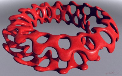
All the 3D meshes in here I created in the freeware program TopMod. It’s is not a user friendly program but those of you that are into the hardcore polygonal modeling might be able to wrap your head around it. Admittedly, I followed some online tutorials (more than once) on how to create the models I rendered in here. And, these models and renders of mine are crap compared to the beauty renders that exist elsewhere, lol. All in all, its a challenging program but very satisfying when you do catch on and it can create some very tight 3D meshes!
TopMod – As of this writing they are renovating their site.
TopMod Download – Get yer TopMod program here!
TopMod video tutorials on YouTube.
Google Image search “TopMod” – Amazing renders, check’em out.
“The Thinker”
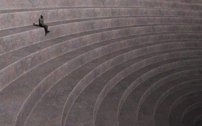
My 3D version of “The Thinker” by photographer Hiromu Kira, all credit to him.
Original photo was circa 1930 taken at the Hollywood Dam.
My specs: Basically just a low-poly figure, a displacement map for the steps and a soft shadowed sun.
Sometimes simple is better, thanks Hiromu.
“Cardboard”
It’s pretty much the law…if you play in 3D, apparently you must, at some point, create various “sphere” renders.
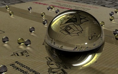
The most enjoyable part of this was what I always love doing and that was creating the texture (for the cardboard), it had to be quite large since I wanted it to not only stand up to rendering out large for print but also because the main sphere would be magnifying part of it. (small image textures rendered out large become visually pixelated and ugly)
At the time, I created the image texture at 4K but if I were to go back to this I would most likely re-ceate the texture at 8K because at the minimum, the render would be 3300 pixels across (for 11″ paper printing) and because of that big sphere’s magnification. Also, in case I ever made a poster print of it, it may be printed out 3 feet across (36″) which is 10,800 pixels. Add onto that, the main sphere magnifying the cardboard and I would really need a bigger image texture to stand up to that level of size so it would not look pixelated.
The best alternative to make sure there would be no pixelation would be to create a procedural texture to look like that ribbed cardboard and then make very large stencils of the typography and graphics that are “printed” on the cardboard and then use that to drive everything. Which would mean amazing quality of the image even when rendered out really huge.
It’s a thought…;o)
“Billiard Balls” – 3D World Magazine
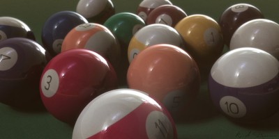
This was a simple scene I made for 3D World Magazine to show how stock atmosphere settings could be used in conjunction with HDRI lighting to attain a further level of realism as compared to just using HDRI lighting alone. All textures made from scratch in Photoshop as was post-work DOF blurring.
“Fish Out of Water”
I’ve always been drawn to the images of boats left out to rot on dried up lake beds.
Why not a submarine that seems to be waiting for a flood?
“KnotPlots”
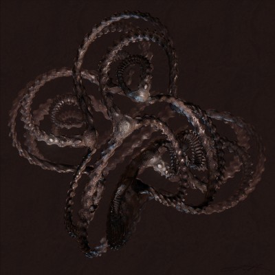
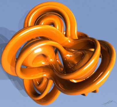
Let’s start this blog off by spotlighting what is a pretty interesting piece of software called KnotPlot.
Now, I had wanted to tell you of an cool piece of Freeware, which KnotPlot used to be, yet the programmers decided to give their software seemingly no real updates (that I can see?) save for the “1.0″ but started charging $30 for it. So, if you already have an older version of program that you had downloaded, hold onto it, from what I can tell the older versions does exactly what the new retail version does, of which the most important parts are actually being able to export your mesh as a .obj or your current view as a .eps (2d vector image).
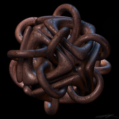
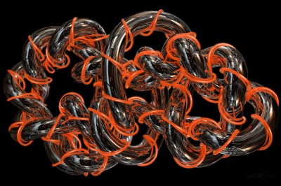
Anyway, these are a couple of older renders using .obj meshes that I had made/exported out of the older freeware version of KnotPlot.
It’s a funky-cool program and for some reason I have always had a soft spot for programs with a unique gui. (ZBrush, any gui created by Kai Krause, etc.)
KnotPlot is still definitely worth the download to take a look at as it has tons of presets and has a bit of a “meditational playtoy” vibe to it. Basically, it’s fun to twiddle with along with being nicely quirky.
