Artwork and resources, past and present.

Latest

Welcome!

Congratulations on effectively stubbing your toe on my tiny slice of the web.

Here you’ll find my recent artwork, my own free graphic offerings and links to many of the offsite resources that I use.

Now, since a long self intro might pain you only as I can imagine, let me cut to the chase and I’ll toss you my main bullet points;

  • I’m Kirk. (Yes hi, pleased to meet you)
  • I’m a CGI (Computer Generated Image) artist and I create artwork in 2D and 3D.
  • 2D programs = Mainly Photoshop.
  • 3D programs = Mainly Maya, Zbrush and Sketchup.
  • I have worked 2D/3D freelance off and on for many years but have also worked in film as an art director, screenwriter and with IMD in 3D motion capture.
  • I am originally from Southern Illinois and I have lived in California since 1985 and now in Los Angeles for the last 10 years.
  • At this point in my life, I am most likely psychosomatically addicted to Dr. Pepper.

Now that you know everything that matters, I would say that about wraps up our internet courtship. I now return you to my blog, already in progress.

Enjoy!

Resume                Download: PDF or DOC or PNG

Website                www.kirkdunne.com
Email                     kirk@kirkdunne.com

Film Credits        http://www.imdb.com/name/nm3180295/
LinkedIn              http://www.linkedin.com/in/kirkdunne
Twitter                  http://twitter.com/kirkdunne

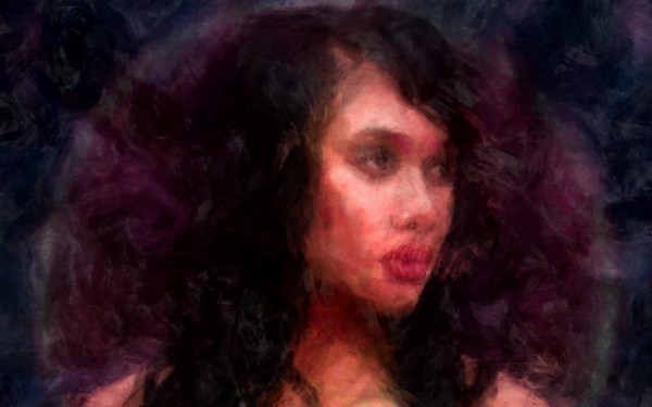
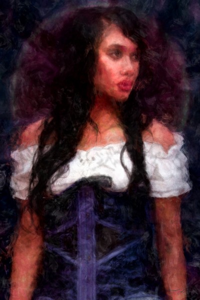
Barmaid Painting

*Print available over at deviantART.

With this painting I used stock photography by Cathleen Tarawhiti as my starting point and color reference.

The finished file consists of three layers of paint (rough underpainting, medium detail and a touch-up layer), and two
layers of pencil (one shading, one sketch) also a couple effects layers and a ridiculous amount of adjustment layers.

The final painting was done in Photoshop CS6 at 3,600 x 5,400 in 16-bit with the ProPhoto RGB gamut, so in comparison
with these jpg’s, the real color count is actually far higher and more intense. (and a pain to convert back for the web)

Big thanks to Cathleen for her beautiful stock collection and to the wonderful model, Mahia Keepa-Hale!

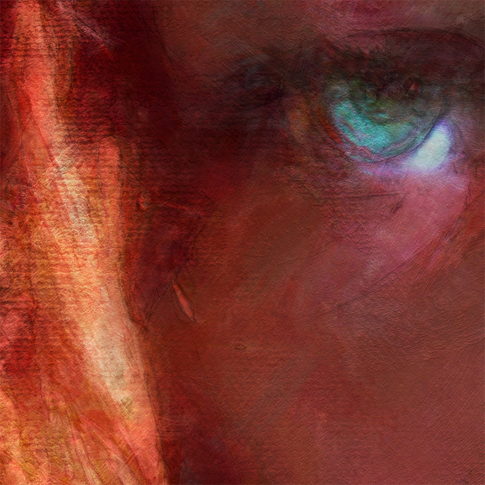
Here is a desktop wallpaper version (2560×1600). You can catch more detail in this crop, click through to get the full sized image;

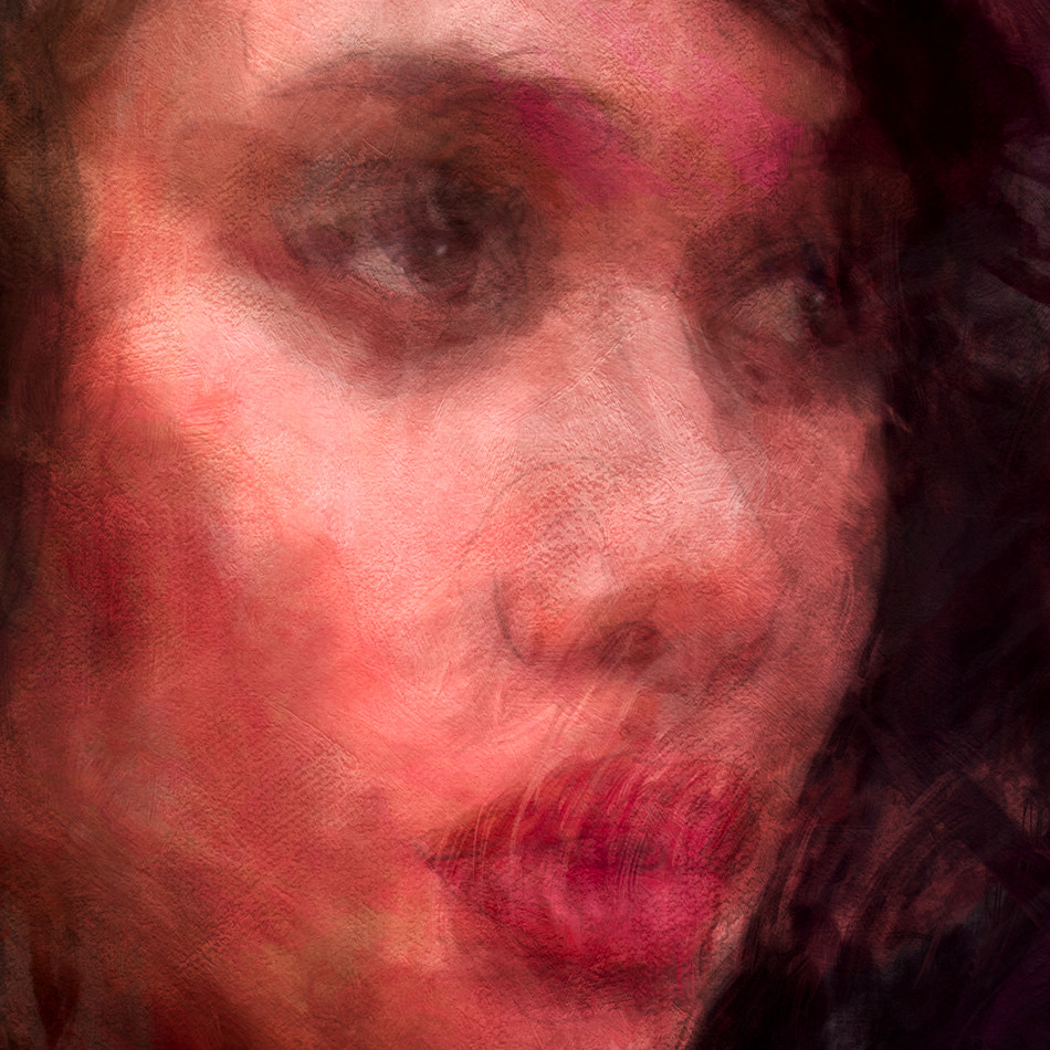
Here is a 1:1 crop from the full sized original;

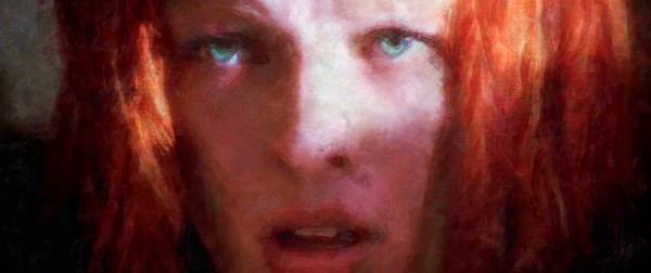
Leeloo from “The Fifth Element”

Painting of Leeloo from the movie “The Fifth Element” as played by Milla Jovovich.

Click through the first image to get to the wallpaper sized 2560 x 1078 image.

This is a second version of my Leeloo painting and I had actually finished it some time ago but have just been forgetting to upload.
The first version I had put up on my Facebook and you can see that here if ya want.

Version two here was made because I was generally not 100% happy with the overall look of the first and
I had additionally wanted to further the realism of the canvas with some new techniques I had developed.

Both versions were painted in Photoshop CS5 64-bit with 16-bit color.
v1 = 2,552 x 1,065
v2 = 5,700 x 2,400


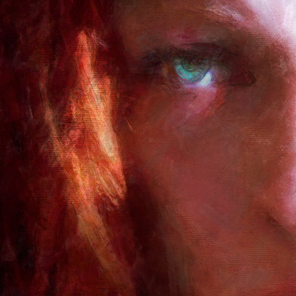
Here’s a half sized detail from the original;


And, here’s a full sized piece from the original;


What pixel dimension to start painting in?

These days it less of a question of what dimensions but what aspect ratio do you like? The standard dimensions a HDTV has
is 1,920 x 1,080 and btw, that is an aspect ratio of 16:9 so, really that should be your absolute minimum small sized image.
But, you really should be creating much larger images than that.

What about printing? Printing requires larger dimensions than 1,920 x 1,080 to be able to output a good looking print. And, believe
me, if you spend any amount of time working on a piece of art, you are going to want a great looking print sooner or later.

Now, let me get this out of the way as far as concerning DPI, here’s what I have always done; pretty much EVERYTHING on this
planet that prints has a standard of 300dpi, whether it is a home printer or a giant room of massive printers that create newspapers
or even magazines. I have NEVER thought in any other DPI other than 300, period and that is my suggestion to you. You will
have way less headaches if you do this. Trust me.

Most people have a home printer, of which most print out on a 8.5″ x 11.0″ piece of paper. Now 11.0″ at 300 dpi equals 3,300 pixels
so, you could create your images at 3,300 pixels and your second dimension depends on what aspect ratio you want. If you want to
stick to a 16:9 ratio and give it that cinema looking structure than you would create images at 3,300 x 1,856 pixels.
(A full 8.5″ x 11.0″ sheet of paper would equal 3,300 x 2,550 pixels)

Now, lets go one small step further. Lets say you want to paint something that could be used for film. Film is projected right now either
at 2K or 4K. What that refers to is the width of the image and 2K means 2,048 pixels and 4K is double that at 4,096 pixels. So, for a further
suggestion here, I would suggest painting a little larger and embrace the 4,096 pixels wide. It gives you a little more room to paint detail
in and most film industry painters create images twice as big as they need even if it needs to be re-sized down to 2K.

One more step, since I myself create with printing in mind;
Some of you have asked why I create images in a length of 5,700 pixels. Two reasons;
- For commercial printing; a standard 24″x36″ poster has a trim/bleed on all sides of 1″
which makes it 26″x38″ and at 300dpi, (*but at half-resolution) that would be 19″ tall which is 5700 pixels.

- For home printing, the largest print that can be made out of a consumer model is 13″x19″
and again, 19″ at 300dpi is 5700 pixels. So, 5,700 pixels is a good compromise for me.

*Why “Half-Resolution”?;
- Images can be printed out at twice their original size and still look “decent”, especially images that have a lot of
of little detail/noise/chaos going on throughout the image.

- And, because I haven’t yet attempted to create a full sized (26″x38″) painted poster which (knowing me, would be many layers)
and at 7,800 x 11,400 that would most likely be around a 10gb sized file. In short, it would make my current computer
cough and fall over, dead. I’ll leave that adventure to a future computer that has SSD’s and at least 32gb of ram.

Good luck!
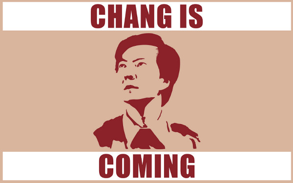
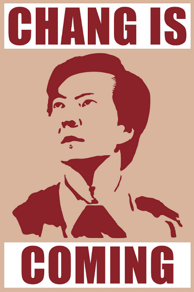
“Community” – Chang Rising Poster #2

“Community” RETURNS – March 15th – 8:00pm – NBC

Community Returns TODAY, so be ready with my next Chang Rising Poster!

This one may be half size but still looks Chang-tastic printed out full sized at 24 x 36!

Glorious “Manilla” poster: (4.5Mb, jpg) (3,600×5,400)– Download Here!

Again;
All rights reserved to: NBC, Sony Pictures Television, Universal Media Studios, Russo Brothers,
Harmonius Claptrap, Krasnoff Foster Productions, the eternaly Chan-tastic Ken Jeong and
anyone else at NBC that will promise to never even THINK about cancelling “Community”!

Now pardon me while I stare at my blackened HDTV for the next 12 hours until COMMUNITY COMES ON.

Kirk
kirk@kirkdunne.com

Twitter: @KirkDunne

#changrises !!!!!!!!!!!!!!!!!!!!!!!!!!!!!!!!!!!!!!!!!!!!!!!!!!!!!

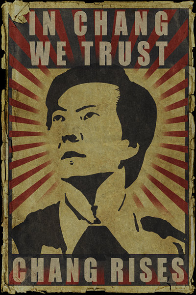
“Community” – Arise, Chang Army!

In Chang We Trust

*NOTICE – If I did happen to guess WRONG at what is at the bottom of this poster, I WILL be adding a corrected version.

Chang Poster available in;

Wallpaper sized: (104kb) (2560×1600) – Download Here!  -  Also, a 16:9 ratio wallpaper: (62kb) (1920×1080) – Download Here!

Gloriously full-sized poster: (714kb) (7,200×10,800, which is 24″x36″) – Download Here!
This one is so Chan-tasticly huge it probably won’t load into most browser windows.
I suggest right-clicking the link and choosing “Save Link As”

Info;
Based upon the Chan-tastic Chan poster being unfurled in the “Community Returns!” trailer.
Watch the video here, Chang poster at the 0:30 second mark)
Obviously, I’m just guessing at what’s actually at the bottom of that poster.
Come March 15th, the full Chang shall be revealed!

All images are in png format, created in Photoshop CS5.

All rights reserved to: NBC, Sony Pictures Television, Universal Media Studios, Russo Brothers,
Harmonius Claptrap, Krasnoff Foster Productions, the eternaly Chan-tastic Ken Jeong and
anyone else that would like to dogpile in on some of this copyright action.

“To know your Chang, you must become your Chang.”
– The Art of Chang

Kirk
kirk@kirkdunne.com


*This page is in fandom spirit of the AMAZING NBC comedy Television show “Community“.
If you’ve never seen it, do so NOW and level up your coolness by a roll of at least +10.

*So, realize this is all in fun and therefore I am not a communist.
(Sorry commies)

*I am also not a rabid celebrity stalker of Ken Jeong.
(Sorry Ken, you are awesome…but at this moment in my life, you’re just not “go to jail” awesome…as I am still paying off my plasma flatscreen)

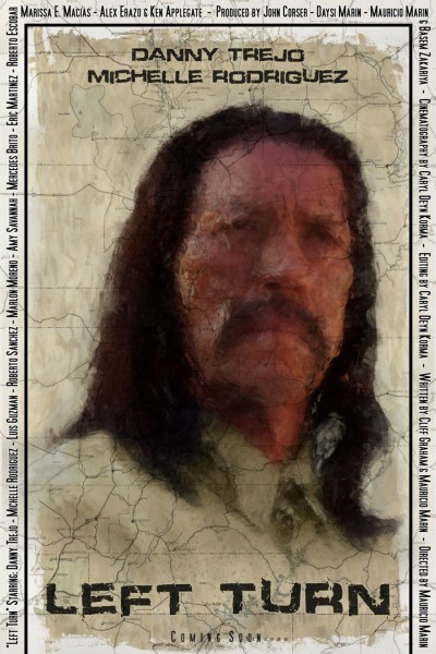
“Left Turn” – The Road Poster

Based upon Director Mauricio Marin’s idea of having the lines of the road fading outward from the expressionistic
facial lines of Danny Trejo (Samuel Lopez) this is the first in a series of posters for the film “Left Turn”.

I finished this piece quickly, so what you see here will most likely be the first version with a more refined second
version to come as I feel this could be fleshed out much more faithfully to Mauricio’s original idea.

But, for now v2 will wait as more and different art is to come for “Left Turn”.

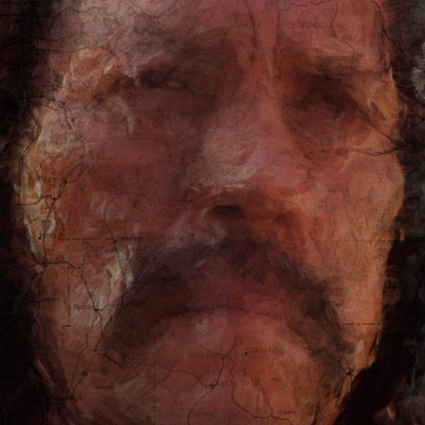
Here’s a 1:1 detail, click through to see its full size;

Technical Info;
Painted in Photoshop CS5 in around 50 hours.

Because of how quickly I needed to completed this, it is only half sized at 12″ x 18″, 300dpi.
(v2 will be the standard 24″ x 36″)

For the initial sketching and layout, I used VFX Workshops Pencil Brush Pack, available here.

For painting, I used mainly the default CS5 Mixer brushes. I have some custom
Mixer brushes but they aren’t very far away from the default setup’s at all.

“Left Turn” at IMDb.

Dream Film Studios

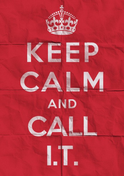
Keep Calm – I.T. Poster

Click through on the main poster below to grab the high-res version (2480×3508) (4mb jpg)

Made for fun and for an associate that works in I.T.
(Information Technology)

Created in Photoshop CS5, roughly 30 minutes.
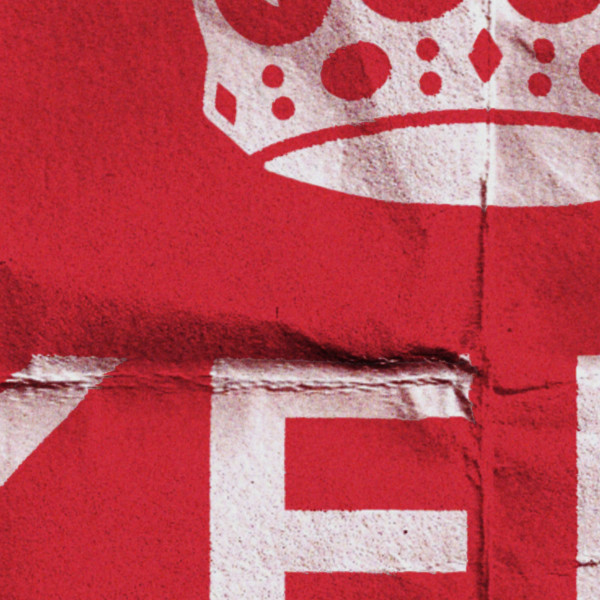
Detail of full size.


The history on the original, UK “Keep Calm And Carry On” posters can be read about here.